The New York Mets haven’t had much to point and laugh at with the first place Atlanta Braves. Steamrolling through the year as they have, the ball club did reveal a horrifying jersey patch.
— Atlanta Braves (@Braves) May 18, 2023
Quikrete is a fine enough product, but who are they trying to entice with this color scheme? The design belongs under the feet of Dorothy Gale, the Scarecrow, Tinman, and Cowardly Lion and not on a baseball jersey. It’s a bar of soap, basically. They couldn’t even bother to get it close to the Braves colors, could they?
The Braves didn’t learn from the NY Mets failure with a jersey patch of their own
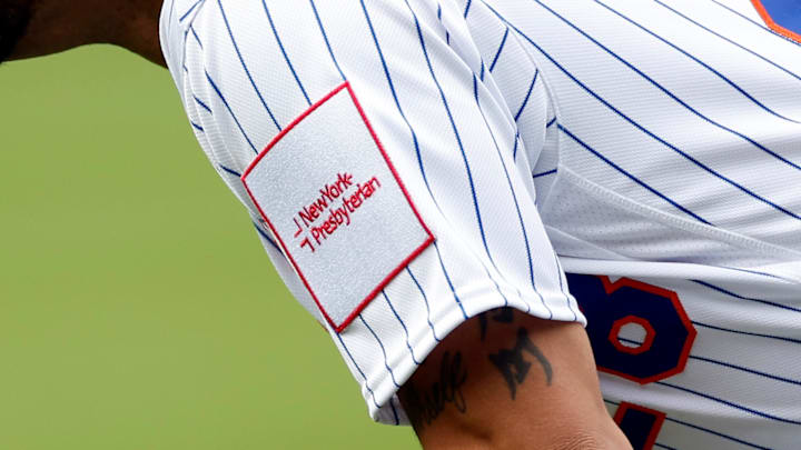
Mets fans know a thing or two about bad jersey patches. Earlier this year, the organization was roasted online for the first installment of the New York Presbyterian patch added to the sleeve. Clunky like a brick, Steve Cohen quickly responded by saying it should be changed because it was “Phillies colors.” The mistake was eventually corrected and this unflattering one the Braves will wear might need some reconsideration as well.
It’s not even an appealing color of yellowish gold. Did a dehydrated dog pass through and make share his opinion with it?
What’s most fascinating is that if you search for Quikrete images you’ll find plenty where red is used. That may be all that’s missing from this patch. Something is needed to symbolize this isn’t a money grab even if that’s the whole purpose of advertising on a sleeve.
Jersey sleeve patches are the least of the concerns for the Braves or even the Mets. And frankly, is anyone going to travel to a particular hospital because they advertise with their favorite baseball team? How many people will now mix cement with a different brand because Ronald Acuna Jr. has the logo of a particular company on his shirt?
Braves fans were equally as disgusted with this as we are. It doesn’t matter who you root for. We all know a bad color scheme when we see it.
Not too late to delete this.
— Jacob (@JacobFournierr) May 18, 2023
What’s the deal worth? I need to know if this ugly yellow patch is worth it.
— Peyton Gleaton (@TheOtherPeyton) May 18, 2023
This tracks since a lot of our pitchers have arm stiffness
— Jay Dunnah, Eddie Rosario supporter (@JDunnah) May 18, 2023
Is this how we afford Ohtani?
— Matt White (@MWhiteXX) May 18, 2023
