%20%20--%3E%0A%3Csvg%20version%3D%221.1%22%20xmlns%3D%22http%3A%2F%2Fwww.w3.org%2F2000%2Fsvg%22%20xmlns%3Axlink%3D%22http%3A%2F%2Fwww.w3.org%2F1999%2Fxlink%22%20x%3D%220px%22%20y%3D%220px%22%0A%09%20viewBox%3D%220%200%20868.5%20200%22%20style%3D%22enable-background%3Anew%200%200%20868.5%20200%3B%22%20xml%3Aspace%3D%22preserve%22%3E%0A%3Cstyle%20type%3D%22text%2Fcss%22%3E%0A%09.st0%7Bfill%3A%23231F20%3B%7D%0A%09.st1%7Bfill%3A%23002B74%3B%7D%0A%09.st2%7Bfill%3A%23FF4A00%3B%7D%0A%09.st3%7Bfill%3A%23FFFFFF%3B%7D%0A%3C%2Fstyle%3E%0A%3Cg%20id%3D%22Template%22%3E%0A%3C%2Fg%3E%0A%3Cg%20id%3D%22Layer_2%22%3E%0A%09%3Cg%3E%0A%09%09%3Cpath%20class%3D%22st2%22%20d%3D%22M126.5%2C145.2c-2.7-6-2.9-15.2-4-24.9c-0.3-2.9-2.4-14.8-8.1-21c-5.6-6.2-12.7-8.7-13.8-9.4%0A%09%09%09c10.2-3.8%2C16.4-8.6%2C20.3-15.9c6.7-13%2C7.3-27.3-5.1-39.7c-3-3-7.6-5.4-13.7-7.5c-23-8.1-62.7%2C2.5-83.7-4.4%0A%09%09%09c-6.7-2.2-7.9-7.1-8.7-10.8c-0.6-3.5-5.2-0.6-7%2C2.1C0.1%2C18-3.1%2C27.3%2C6.3%2C33.9c11.3%2C7.9%2C47.2%2C4.4%2C69.6%2C4.8%0A%09%09%09c24.1%2C0.3%2C27.9%2C18.7%2C18.7%2C35.4c-7.1%2C12.5-23.7%2C11.6-26.4%2C10.8c1.1-3.8%2C9.4-28.9%2C10.3-32.2c1.8-5.6-2.4-9.7-7-8.4%0A%09%09%09c-6.2%2C2.1-5.1%2C4.9-25.2%2C10c-6.8%2C1.7-3.6%2C5.7-1.7%2C9.4c0.6%2C1.1%2C0.5%2C3.3%2C0%2C5.6c-0.3%2C1.3-14.1%2C48.7-18.3%2C61.1%0A%09%09%09c-1.3%2C3.7-3.3%2C4.6-5.9%2C6.5c-5.7%2C4-6.8%2C9.7%2C0.8%2C9.7c12.1-0.2%2C23.2%2C0%2C34.5%2C0c3%2C0%2C5.1-1.4%2C5.2-4.4c0-5.2-6.2-5.2-6.3-8.3%0A%09%09%09c2.4-9.5%2C6.8-27.1%2C9.7-36.4c8.7-0.6%2C15.6%2C1.4%2C20.2%2C4.8c5.7%2C4.1%2C6.3%2C12.7%2C6.7%2C16c0.9%2C11.1%2C1.6%2C26.7%2C4.6%2C35.2%0A%09%09%09c2.1%2C5.7%2C5.2%2C11.3%2C10.3%2C14c13%2C6.8%2C29.4%2C1.3%2C34.9-2.2c4.3-2.4%2C5.6-5.6%2C4-8.4C143%2C153.3%2C132.7%2C158.9%2C126.5%2C145.2z%22%2F%3E%0A%09%09%3Cpath%20class%3D%22st2%22%20d%3D%22M162.4%2C65.8c6.5%2C0%2C12.4-4.9%2C13.2-11.1c0.9-6.3-3.7-11.3-10-11.3c-6.5%2C0-12.4%2C4.9-13.3%2C11.3%0A%09%09%09C151.5%2C60.9%2C155.9%2C65.8%2C162.4%2C65.8z%22%2F%3E%0A%09%09%3Cpath%20class%3D%22st2%22%20d%3D%22M275.2%2C65.8c6.5%2C0%2C12.4-4.9%2C13.2-11.1c0.9-6.3-3.7-11.3-10-11.3c-6.5%2C0-12.4%2C4.9-13.3%2C11.3%0A%09%09%09C264.3%2C60.9%2C268.7%2C65.8%2C275.2%2C65.8z%22%2F%3E%0A%09%09%3Cpath%20class%3D%22st2%22%20d%3D%22M465.2%2C110c0.9-2.1%2C2.2-6.8%2C0.5-8.6c-2.7-2.9-8.1-1.9-10.3%2C1.9c-3.8%2C6.8-8.6%2C22.9-17.5%2C23.5%0A%09%09%09c-1.4%2C0.2-2.5-0.3-3.5-1.3c-0.8-1-1.3-2.5-0.3-7.9c2.1-7.1%2C3-10.6%2C4.3-14c3-8.9%2C5.7-15.7%2C6.7-17.6c3-5.7%2C4.4-6.7%2C4.8-9.2%0A%09%09%09c0.5-1.9-0.8-3.2-2.1-3.5c-3-0.6-4.8%2C1.6-9%2C2.2c-5.2%2C1-14.1-1.1-14.6%2C2.2c-0.8%2C5.4-2.5%2C9.7-5.1%2C16.8c-6.8%2C20.5-9.4%2C26-9.9%2C27.9%0A%09%09%09c-8.6%2C21-18.6%2C13.3-17.3-0.3c0.5-4.8%2C1.3-10.6%2C3.2-16.5c5.1-15.2%2C10.2-20.8%2C16.4-21c2.4%2C4.1%2C8.9%2C2.7%2C9.4-2.4c0-3.8-3-7.5-12.9-6.7%0A%09%09%09c-17.2%2C1.2-33.8%2C15-39.4%2C33.4c-3.9%2C8.4-8.3%2C19.8-15.1%2C18.8c-3.2-0.3-3-4.8-2.2-8.6c0.5-2.9%2C4.6-15.4%2C4.8-22.5%0A%09%09%09c0.2-8.9-5.9-19.2-18.4-19.7c-5.1-0.2-9.5%2C2.2-13.5%2C5.4c1.3-1.9%2C1.9-2.9%2C2.2-4.6c0.2-1.8-1.1-3.2-2.1-3.3c-3-0.8-4.9%2C1.6-9%2C2.2%0A%09%09%09c-5.4%2C0.9-14.3-1.1-14.9%2C2.2c-0.8%2C5.2-2.2%2C9.7-4.9%2C16.8c-2.2%2C5.9-4.2%2C11.5-6.2%2C17.1c-3.3%2C6.9-7.4%2C14.4-13.3%2C15%0A%09%09%09c-1.4%2C0-2.5-0.3-3.5-1.4c-1.1-1.3-1.6-4.6%2C1.1-13.3c4.1-13%2C8.3-23.7%2C9.5-26.2c2.9-5.7%2C4.4-6.5%2C4.8-9.2c0.3-1.9-1-3.2-1.9-3.3%0A%09%09%09c-3.2-0.8-4.9%2C1.4-9.2%2C2.2c-5.4%2C1-14.3-1.3-14.8%2C2.1c-0.8%2C5.4-2.2%2C9.7-4.9%2C16.8c-1.1%2C3-3%2C8-4.6%2C12.5c-2.3%2C5.2-6%2C12.4-12.2%2C17.7%0A%09%09%09c-0.8%2C0.6-2.1%2C1.4-3.5%2C2.1c1.6-7.8-2.5-16.5-13-23.2c-2.9-1.9-6-3.7-8.7-5.4c-3.5-2.2-4.6-5.9-3.6-10.2c1.6-7.5%2C13.7-6.7%2C15.7-3.3%0A%09%09%09c-2.7%2C1.7-5.7%2C4.9-5.9%2C8.4c-0.2%2C5.7%2C4.3%2C10.6%2C10%2C10.8c10%2C0%2C14.4-10.2%2C11.3-18.3c-3.5-8.9-13.3-12.1-22.7-12.4%0A%09%09%09c-9-0.3-18.3%2C1.4-26.4%2C6.5c-7.3%2C4.6-10.5%2C10.9-11.1%2C17.5c-0.1%2C1.4%2C0.2%2C2.6%2C0.4%2C3.8c-0.8%2C0.6-1.5%2C1.3-2%2C2.2%0A%09%09%09c-3.8%2C6.8-8.7%2C22.9-17.5%2C23.7c-1.4%2C0-2.5-0.3-3.5-1.4c-1.1-1.3-1.6-4.6%2C1.1-13.3c4.1-13%2C8.3-23.7%2C9.5-26.2%0A%09%09%09c2.9-5.7%2C4.4-6.5%2C4.8-9.2c0.3-1.9-1-3.2-1.9-3.3c-3.2-0.8-4.9%2C1.4-9.2%2C2.2c-5.4%2C1-14.3-1.3-14.8%2C2.1c-0.8%2C5.4-2.2%2C9.7-4.9%2C16.8%0A%09%09%09c-2.1%2C5.7-7.1%2C19-7.6%2C20.8c-1.4%2C4.6-2.4%2C11.3-2.4%2C13.5c0%2C5.2%2C1.3%2C8.6%2C2.4%2C10.2c6.9%2C9.3%2C23.6%2C11.2%2C40.5-7.8%0A%09%09%09c-0.4%2C6.4%2C3.8%2C10.8%2C9.4%2C12.7c7.6%2C2.4%2C17.1%2C2.4%2C18.3%2C2.4c13.2%2C0.2%2C24-1.6%2C36.7-9.5c2.2-1.4%2C4.1-2.9%2C6-4.4c0.4%2C3.1%2C1.1%2C5.5%2C2%2C6.6%0A%09%09%09c5.5%2C7.5%2C17.4%2C10.2%2C30.6%2C1.2c0.1%2C2.8%2C2.3%2C5.3%2C5.3%2C5.3h13.3c2.2%2C0%2C4.3-1.6%2C5.1-3.8c5.1-14.1%2C8.9-26.7%2C14.3-39.5%0A%09%09%09c1.7-4.1%2C4.3-8.6%2C6.2-11.3c4.9-6.8%2C14.1-9.2%2C10%2C3.8c-6.7%2C21.1-13%2C36.2-7.1%2C44.5c7%2C9.6%2C24.5%2C11.1%2C41.8-9.4c1.2%2C3%2C2.7%2C5.7%2C4.9%2C8%0A%09%09%09c9.2%2C9.7%2C22.5%2C8.4%2C31.1%2C3.2c-0.6%2C2.4-1.3%2C5.1-1.7%2C7.5c-9.8%2C42.5-37.5%2C30.6-34.3%2C20.5c5.9%2C1.6%2C12.7-1.1%2C12.5-8.2%0A%09%09%09c0-5.6-6-9.9-12.4-6.5c-3.5%2C1.7-3%2C3.2-5.2%2C3c-9.4-1.1-24-2.2-29.5-2.5c-15.9-1.1-37.5-2.9-50.5-1.6c-4.1%2C0.3-21%2C3.3-21.4%2C16.4%0A%09%09%09c-0.5%2C7%2C4.4%2C13.5%2C12.1%2C14.5c12.4%2C1.9%2C19.7-9.9%2C30-12.5c11.4-2.9%2C33-5.4%2C53.8-3.2c-1.1%2C6.5%2C0.2%2C13.8%2C3%2C18.3c3.8%2C6.2%2C10%2C9.7%2C18.9%2C11%0A%09%09%09c21.3%2C2.9%2C33.3-14%2C37.5-22.9c4.8-10.3%2C7.5-20.5%2C7.5-20.5l2.2-9c8.4-0.5%2C18.9-5.9%2C29.2-19.8C462.1%2C118.1%2C463.4%2C114.3%2C465.2%2C110z%0A%09%09%09%20M204.7%2C137.8c-3.5%2C0.9-6-0.3-7-4c-0.6-2.2-1.7-6.7-5.9-9.2c-1.8-1-5.2-1.7-8.4-0.7c3.1-4.6%2C4.6-7.8%2C5.8-10.7%0A%09%09%09c7.9%2C7.2%2C19.5%2C12.3%2C19.7%2C17.6C209.1%2C134.6%2C207.5%2C137%2C204.7%2C137.8z%22%2F%3E%0A%09%09%3Cpath%20class%3D%22st2%22%20d%3D%22M589.9%2C158.3c-2.4-2.8-12.1%2C1.8-18.1-11.3c-0.3-0.7-0.6-1.4-0.9-2.1C558.7%2C115.5%2C550.8%2C47%2C549.7%2C30%0A%09%09%09c1-1.6%2C2.1-3.5%2C2.5-4.8c2.5-5.9-2.2-10.6-6.2-8.7c-6.5%2C2.4-3.2%2C4-24.1%2C9.8c-7.1%2C2.1-3.8%2C6.5-1.7%2C10.6c0%2C0.3%2C0.3%2C1.4%2C0.6%2C3%0A%09%09%09c-2.4%2C4-53.7%2C87.7-57.3%2C92.3c-2.1%2C2.9-4.1%2C3.5-6.5%2C5.7c-3.8%2C3.5-3.8%2C8.7%2C2.5%2C8.6c1.7%2C0%2C17.3%2C0%2C25.6%2C0c2.9%2C0%2C4.6-2.9%2C4-5.6%0A%09%09%09c-0.6-2.5-3.8-5.4-3.8-6.2c0-6.3%2C5.7-16.7%2C7.6-20c1.4-2.4%2C4.6-2.7%2C7.6-2.7c6.2%2C0.2%2C21.7%2C0.3%2C30.3%2C0.3c1.6%2C8.6%2C5.9%2C30.9%2C10.2%2C42.9%0A%09%09%09c2.1%2C5.7%2C5.2%2C11.3%2C10.3%2C14c3.4%2C1.8%2C6.9%2C2.7%2C10.5%2C3c10.2%2C1%2C20.3-2.7%2C24.5-5.3c0.5-0.3%2C0.8-0.6%2C1.2-0.9c3.2-2.3%2C4.1-5%2C2.7-7.5%0A%09%09%09C590.1%2C158.4%2C590%2C158.4%2C589.9%2C158.3z%20M523.7%2C58.5c2.7%2C22.2%2C3.5%2C28.7%2C4.8%2C39.9l-28.1%2C0.2C504.6%2C91.1%2C516.5%2C70.6%2C523.7%2C58.5z%22%2F%3E%0A%09%09%3Cpath%20class%3D%22st2%22%20d%3D%22M559.7%2C178.4c-2.6%2C7.8-4.5%2C13.4-4.8%2C14.4c-1.3%2C3.5%2C1.4%2C7.1%2C5.1%2C7.1h13c2.2%2C0%2C4.3-1.4%2C5.1-3.7%0A%09%09%09c2.3-7.2%2C4.4-14.2%2C6.6-21.2c-5.2%2C2.2-12%2C3.9-19.2%2C3.9C563.6%2C179.1%2C561.6%2C178.7%2C559.7%2C178.4z%22%2F%3E%0A%09%09%3Cpath%20class%3D%22st2%22%20d%3D%22M864.3%2C47.9c-3.8-10.3-10.8-21.4-28.1-32.1c-9.2-5.7-20.8-8.4-31.3-9.5C763.5%2C2%2C721.1%2C24.1%2C684.1%2C31.2%0A%09%09%09c-9.7%2C1.9-30.2%2C0.6-31.8-12.2c-0.6-5.4-1.4-11.1-4.8-14.8c-5.1-5.2-15.9-5.9-23.2-0.5c-16%2C11.9-5.6%2C34.9%2C11%2C44.6%0A%09%09%09c14.1%2C8.1%2C31.1%2C7%2C43.2%2C4.8c47.2-8.7%2C84-35.6%2C127.3-31.9c42.1%2C3.7%2C55.4%2C42.4%2C43.8%2C73.7c-4.4%2C10.8-10.9%2C20.2-20.2%2C26.7%0A%09%09%09c-5.2%2C3.5-11.6%2C6.2-19.1%2C5.6c-3.3-0.3-7.3-2.4-8.7-5.2c8.7-3.3%2C27.9-11.3%2C34.9-22.5c7.6-11.9%2C1.6-24.3-16-23.5%0A%09%09%09c-21.6%2C1-39%2C17.2-44.2%2C33.9c-3.7%2C8.2-8%2C18.3-14.6%2C17.6c-5.4-0.6-0.8-13.8-0.8-13.8c2.7-8.4%2C17.6-52.9%2C23.3-70.8%0A%09%09%09c1.4-4.6-2.1-8.1-5.9-7c-5.2%2C1.7-4.3%2C4.1-21.1%2C8.4c-5.7%2C1.4-3%2C4.8-1.4%2C7.8c0.8%2C1.6%2C0%2C5.4-0.8%2C8.1c-2.5%2C7.2-11%2C31.1-16%2C45.2%0A%09%09%09c-1.7%2C3.9-5.6%2C14.2-14.5%2C21.5c-1.6%2C1.3-5.4%2C3.6-8.3%2C3c3.5-4.1%2C5.7-7.1%2C8.7-13.8c3.3-7.3%2C4.9-14%2C3.5-22.1%0A%09%09%09c-1.3-7.9-8.4-15.4-17.6-15.9c-5.2-0.3-11.4%2C0.2-15.9%2C0.9c0-0.3%2C0.2-0.5%2C0.2-0.8c0.3-1.7-1-3-2.1-3.3c-3-0.6-4.9%2C1.6-9%2C2.2%0A%09%09%09c-5.4%2C1-14.3-1.1-14.8%2C2.2c-0.5%2C3-1.3%2C5.7-2.2%2C8.9c-0.2%2C0.7-2.9%2C8.6-6.6%2C19.7c-2.1%2C4.9-6%2C12.9-13.3%2C18.9c-1.6%2C1.3-5.4%2C3.6-8.3%2C3%0A%09%09%09c3.5-4.1%2C5.7-7.1%2C8.7-13.8c3.3-7.3%2C4.9-14%2C3.5-22.1c-1.3-7.9-8.4-15.4-17.6-15.9c-5.2-0.3-11.4%2C0.2-15.9%2C0.9%0A%09%09%09c0-0.3%2C0.2-0.5%2C0.2-0.8c0.3-1.7-1-3-2.1-3.3c-3-0.6-4.9%2C1.6-9%2C2.2c-5.4%2C1-14.3-1.1-14.8%2C2.2c-0.5%2C3-1.3%2C5.7-2.2%2C8.9%0A%09%09%09c-0.4%2C1.1-7.7%2C23.1-15.6%2C46.7c1.2%2C3.5%2C2.3%2C6.8%2C3.5%2C9.5c2.5%2C5.6%2C5.1%2C5.8%2C8.8%2C6.2c1.5%2C0.1%2C3.5%2C0.4%2C5.4%2C1.3c0.8-2.7%2C1.7-5.4%2C2.5-8.1%0A%09%09%09c3.8%2C1.6%2C7.8%2C2.9%2C12.1%2C3c5.1%2C0.3%2C10.2-0.6%2C14.1-2.4c10.4%2C4.8%2C20.9%2C1.3%2C29.5-4.9c-8.5%2C25.4-17%2C51.1-17.8%2C53.5%0A%09%09%09c-1.3%2C3.5%2C1.4%2C7.1%2C5.1%2C7.1h13c2.2%2C0%2C4.3-1.4%2C5.1-3.7c5.7-18.3%2C11-35.6%2C16.4-52.7c3.8%2C1.6%2C7.8%2C2.9%2C12.1%2C3%0A%09%09%09c5.1%2C0.3%2C10.2-0.6%2C14.1-2.4c13%2C6.1%2C26.1-0.9%2C35.6-10.1c0.5%2C2.3%2C1.1%2C4.3%2C1.9%2C5.3c6.7%2C9.2%2C23.5%2C11%2C40.4-7.9c2.9%2C9%2C10.2%2C14.8%2C22.7%2C15%0A%09%09%09c30%2C2.2%2C54.8-21%2C63.8-44.3C868.9%2C85.8%2C871.3%2C65.7%2C864.3%2C47.9z%20M623.2%2C115.5c-9.8-0.6-16%2C9-12.4%2C17.9c-3.6%2C2.2-8.1%2C3.6-10.9%2C1.1%0A%09%09%09c-1.7-1.4-0.6-4.4-0.3-6.8c2.7-8.6%2C5.6-16.5%2C7.6-23.3c6.7-15.6%2C13.2-18.3%2C15.6-18.4c3.5%2C0%2C7.1%2C1.7%2C6.8%2C8.2%0A%09%09%09C628.7%2C101.9%2C626.2%2C108.2%2C623.2%2C115.5z%20M700.5%2C115.5c-9.8-0.6-16%2C9-12.4%2C17.9c-3.6%2C2.2-8.1%2C3.6-10.9%2C1.1c-1.7-1.4-0.6-4.4-0.3-6.8%0A%09%09%09c2.7-8.6%2C5.6-16.5%2C7.6-23.3c6.7-15.6%2C13.2-18.3%2C15.6-18.4c3.5%2C0%2C7.1%2C1.7%2C6.8%2C8.2C706.1%2C101.9%2C703.5%2C108.2%2C700.5%2C115.5z%0A%09%09%09%20M810.8%2C88.1c5.4-4%2C12.4-4.1%2C12.6%2C1.3c0.3%2C10.8-15.6%2C19.5-24%2C23.5C799%2C104.9%2C801.7%2C94.4%2C810.8%2C88.1z%22%2F%3E%0A%09%3C%2Fg%3E%0A%3C%2Fg%3E%0A%3C%2Fsvg%3E%0A)

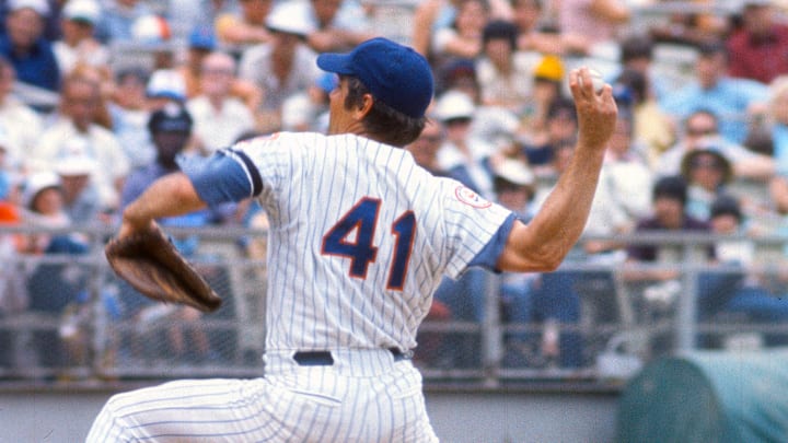
One of my pet peeves, and there are so many, is the inconsistencies with the New York Mets uniforms. And I have almost become obsessed with the details of the uniforms.
Mets radio broadcaster Howie Rose has openly detested the black jerseys that the team has recently taken out of moth balls, and has made it clear that he prefers the “traditional” uniforms. Well the traditional uniforms did not include an orange button on top of the cap. Why is that there anyway? And why does anyone, other than me, notice that it is there? I am actually annoyed at that stupid orange button. It doesn’t belong there.
I was very impressed when I was at a recent game at Citifield and a fan approached me about the jersey I was wearing and asked if I was a Ken Boswell fan. Why would he ask that? Because the No. 12 on the road jersey I was wearing was in a font called “full block” which is different than the “block” font that was worn on the home jerseys. At some point, probably in the early 80’s, the full block was discarded and all of the uniforms sported the block font exclusively.
Most fans have a favorite number already in their heads, and others end up with a favorite number because of a player that they saw wearing that particular number. And that is how I got to wear the No. 12 for most of my sports career. The fan at Citifield was right on point – I chose No. 12 because I had seen Ken Boswell wearing it. What impressed me about the fan picking the name Ken Boswell – with all of the other players who have worn No. 12 while in a Mets uniform – was because the fan picked up on the fact that the No. 12 on the road jersey was in the full block…which meant it had to be a player from an earlier era.
I always preferred the “look” of the full block numbers and have always thought that the block numbers on the road jerseys looked inconsistent with the Tiffany style “New York” on the front of the jerseys. It’s the little things that you notice, right?
New York Mets officials overlooked a not so minor detail
So if a fan could notice that my jersey had a number in a specific font, a font that is no longer used, how could anyone from the Mets organization not notice that the number 41 on the back of the long-awaited and newly-dedicated Tom Seaver statue was not captured properly? That a part of the “4” in “41” was missing?
The artist has made a public apology. He took ownership of the mistake.
But how could anyone who had anything to do with the approval process of the statue not realize that something was wrong?
After years of ignorance, the Mets finally worked to memorialize the person who deserved to be so honored when Citifield opened its gates for the very first time. It looked like the Mets were on the path to getting things right.
The irony of it all is that this is a monument dedicated to a perfectionist, and a person who actually took very special care of how he wore his uniform. Unfortunately, that aspect wasn’t captured. And as obsessed as I am with the uniforms, I will always be focused on that ridiculous looking No. 41 on the back of that die cast jersey.