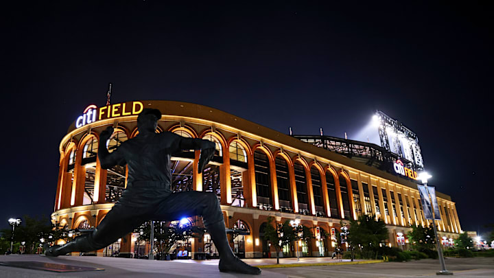
After weeks of speculation, the City Connect uniforms for the New York Mets have been released. Although City Connect uniforms have been around in the MLB for a couple of years, the Mets have never had one of their own until now. There have been some "leaks" throughout the internet the past week, which led to assumptions and preluded opinions by fans. Below, you can see Mets closer Edwin Diaz wearing the new threads.
The Mets City Connect uniforms are HERE! 👀
— MLB (@MLB) April 19, 2024
Honoring everything that makes NYC the World's City. If you know NY, you know pic.twitter.com/Tw3HKX5K9u
Grade given to the "IYKYK" City Connect uniforms : A-
The Mets slogan behind their City Connect uniform is "If you know, you know," as this uniform has impressive details connected to the city of New York. To start, one feature that stands out on this uniform, specifically on their sleeves and also the Nike swoosh on the front of the jersey, is the color purple. Purple is not an ordinary color of the Mets, but they made it a priority because purple resonates with the seven-line train. The seven-line is a famous way of transportation to Citi Field, so this was a great way to incorporate the train.
Another way train transportation was incorporated is the Mets' logo train token on the sleeve. Train tokens were what people used to take the subway, so paying homage to that was neat. The big "NYC" on the front of the jersey is in the same font as the old-school Mets road jerseys, which pays tribute to their history. Many people wanted "Queens" in front of their jersey for the borough they play in, but I think the NYC looks clean and straightforward.
The hat might be my favorite aspect of these jerseys, as it features the Queensboro Bridge. It is a simple way to mention a bridge in the borough, and looks stylistic. Overall, I think they designed these jerseys beautifully, and most of the comments I see on social media also believe so. You can see these jerseys on the field every home Saturday for the rest of the season except for Darryl Strawberry's number retirement day.
The Mets plan to wear their City Connect jerseys for every Saturday home game in 2024 starting on April 27, except for June 1 when the team will retire Darryl Strawberry's number 18, per @martinonyc:
— SNY Mets (@SNY_Mets) April 19, 2024
"It’s at the players’ discretion if they want to add more games with the City… pic.twitter.com/578s6J76pG
