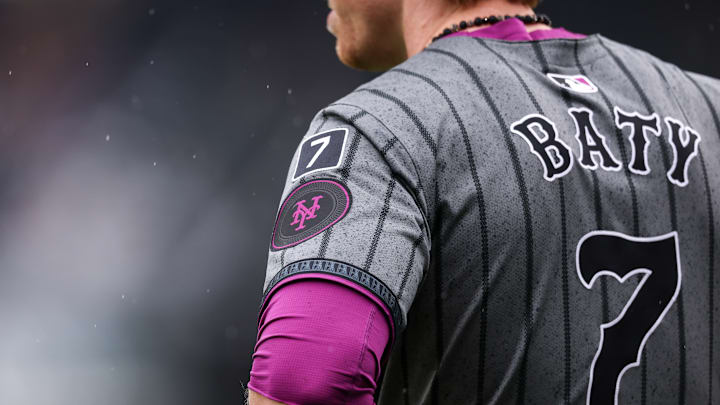
If you're a New York Mets fan, you're all too familiar in recent seasons with turning on SNY to watch the beloved orange and blue, only to find an ugly combination of grey and purple instead. It's far from surprising at this point, but it still doesn't feel right. And fans in recent weeks have begun to vocalize their displeasure with the lingering alternate uniforms. What was originally a fun nod to the city has turned into nothing but an eyesore. What was once a breath of fresh air is now just an eye roll.
The uniforms were introduced in April of last season as a part of a league-wide "City Connect" campaign. The idea, similar to what the NBA has done, was to honor each team's respective city with a uniform specifically designed for it. This has led to considerable confusion for fans who aren't as invested. Most of the time, teams don't even select their own team colors. For some franchises, it has played. For others, it hasn't. For the Mets, it certainly played last season, but not anymore.
It was fun while it lasted, but it's time for the Mets to move on
It was largely due to luck and sheer coincidence that the uniform's popularity exploded initially. It just so happened that the purple the players were now occasionally donning aligned with their eventual secondary mascot, the beloved Grimace. This meant fans going out and buying purple Mets attire. The grey and purple trend took over Citi Field and Mets fans everywhere. Hand up, I own a City Connect-inspired t-shirt.
Last season was a lot of fun. The Mets and their fans got to enjoy a playoff run that they hadn't even sniffed in close to a decade prior. The City Connect uniforms came at the perfect time to become the official wardrobe of the Cinderella story. All that said, it's time to move on. They're no longer that team. This is a team with real expectations and a truly elite roster. This is a team with a brand new identity.
@Mets the city connect uniforms are atrocious. Stop wearing them. #LGM
— J.Isola (@PitinoEmpire) August 2, 2025
Perhaps if the uniforms were beautiful, it would be easy to get past. However, while they were fine for one season, they aren't nice uniforms. The entire design predominantly features neutral colors. Essentially, it's just a grey jersey with black pinstripes and plain white pants. You have to squint to even really see the purple that sits partially on the side of the pants, on the Nike logo, and at the base of the cap. They aren't the picture of fashion, that much I know.
It would be one thing if the uniforms at least incorporated the appropriate team colors. I'll be an "old man yelling at cloud" day and night, but as long as I see orange and blue on my screen, I'll be ok. However, it gets tiresome to see the wrong color constantly. It sounds so childish when I put it that way, doesn't it? But this is what sports are. This is why we watch. I grew up in orange and blue, and silly or not, that means something to me.
I have an infant nephew. While I work tirelessly to ensure that he winds up on the good side of New York baseball (not the Bronx side), it will become challenging to explain what the team's true colors are. Considering it has become a regularity, I wouldn't blame a young, brand-new Mets fan for being confused. If they were worn infrequently as a change-up from the norm, they may at least feel unique and special. Now, they feel like the ugly stepchild of the uniform options.
They might as well just make the city connect the new home standard with how much they wear them. It feels like they’re not even the Mets anymore.
— Brandon (63-49) #LGM (@BWLGM) August 3, 2025
The entire concept is supposed to be that the uniform represents New York City. However, the only local influence is the use of purple for the seven train numbers, the sleeve patch stylized as a subway token, and the "concrete jungle" inspired grey (whatever that means). The seven train is indeed a Flushing, Queens staple. But you know what really represents the city? The blue and orange baseball team that has been playing there since 1962. Fans would like to get back to that. Mr. Cohen, please advise.
