The time that all New York Mets fans have been waiting for with bated breath has finally arrived. No, it's not Opening Day, but the next best thing, Mets Amazin' Day! The Mets fan fest is done in the same vein as the "Queens Crew' is Mets ownership adding a little more fun into the lives of the Mets faithful. The day will include Autograph sessions with Mets past and present, photo opportunities, and deep discounts on some sweet, sweet Mets merch. If that wasn't enough to make you catch Mets fever, it was recently reported that The Amazins will unveil a brand-new road jersey at the event. Since the announcement, rumors have been swirling about what this new uni could look like, and the image of what is said to be a leaked image of a "supposed jersey" has shown up all over social media.
Ever since the announcement, social media has been ablaze with speculation and rumored leaks of the "supposed" new design. As the anticipation built, I found myself tossing and turning at night, restless with curiosity. Eventually, sleep came, and with it, a haunting vision—I was visited by three spirits, one of which was the Ghost of Mets Jersey's Past. What he showed me sent a chill down my spine. The only way to stop the haunting of my mind is to share it with all you fine folks. So here we go: the 5 worst Mets jerseys in franchise history.
1988 Mets Road Yankees Knockoffs

Now, on its own, I actually like this jersey. I am a fan of simple style and for a franchise that can sometimes lend itself to cartoonish choices, as we will see later on. The only thing that puts this jersey on the list is that it was a complete knock-off of the Yankees road jersey they have been using since the dawn of time. It was the exact same Yankees "New York" font across the chest but in blue and orange, with a racing stripe for good measure, and there you have it. What made it even worse is that the Mets were coming off a beautiful script letter road uniforms that are said to be the inspiration for the new uni's in 2025.
The Tail

1993 and 1994 were a weird time for MLB. An eventual strike was looming, and the league seemed stuck in its awkward teen rebellious phase. Besides the strike, all MLB teams would sport a gold MLB 75th Anniversary patch, giving uni a class touch. That nice touch was not enough to save this atrocity. The Jersey was a take on the classic Mets home pinstripes but with an unfortunate tail that extended from the "s" in "Mets" and underlined that underlined the entire word. It's like what you would get if you asked AI to make you a new Mets jersey.
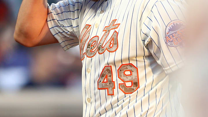
Memorial Day Camo

Don't get me wrong, I'm as patriotic as the next guy, and I believe the sacrifices made by our men and women in uniform should be celebrated. With that being said, when your team colors are bright blue and orange, you can't have it in camouflage. That's a walking, talking, hitting, and pitching oxymoron.
2018 Players Weekend

These were fine if they were the uniforms of the sequel to Artie Lang's 'Beer League.' These would be fine if they were the Jersey of a Little League World Series contender that had just advanced to Williamsport, but this is inexcusable for a professional baseball team. Unless the jersey is of the vest variety (which is awesome), the sleeves should always be the same color as the rest of the jersey. And let us not forget about the "cool and witty" names players were allowed to put on the back, like "OZ" and the "Toddfather."
Mercury Mets

This one takes the cake, no doubt about it. The year was 1999, and the Mets were looking to take part in an ill-fated "Turn Ahead the Clock Night." Just like Y2K, things that seemed like a good idea at the turn of the century were usually not. The powers that be thought it would be novel to "Imagine" what life would be like 25 years in the future – where nothing was impossible, not even the inconceivable. The Black capped-sleeved jersey features the name "Mercury Mets" in silver, along with a graphic of the planet and its symbol. I vividly remember when these came out, and, at the time, I loved them, but I was a pre-teen and, therefore, had no taste. The adult version of me has seen the error of my ways and thus apologizes.
We can only hope that whatever new Uni the Cohen’s unveils is better than these.
